KBB: Moving Forward
Published in Kitchen & Bath Business, May/June 2026 issue.
Custom built in 2012 to the previous owner’s tastes, this McLean, Va., home was way off the mark for the current owners, a professional couple who favored a timeless yet elegant aesthetic. First, the kitchen was cold and dark with its ebony-tinted cabinetry and stainless-steel countertops. Second, the primary bath was unapologetically outdated, sporting dark vanities, travertine and granite. And both spaces suffered from awkward layouts that hindered flow. An avid user of Houzz, the wife looked to the site to find a local fi rm that could capture what she and her husband envisioned and landed on Jordan Design Build Group.
One Room Too Many
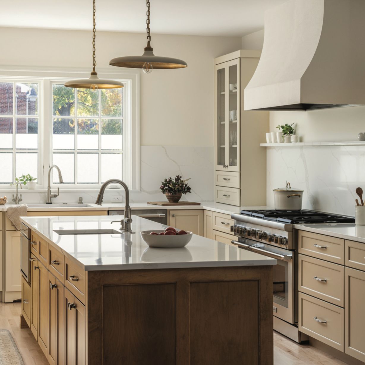
Unappealing aesthetic aside, the kitchen was generous in size, but its layout was dominated by a peninsula that jutted out into the center of the space and extended in front of the only hallway leading to the front door. This impeded flow for anyone using the kitchen and those just arriving at the home. It was obvious that this obstacle had to go, and the clients preferred an island in its stead to sip their daily tea in comfort.
The design team endeavored to deliver an island large enough to accommodate a second sink and countertop space for prep work and seating but needed just a bit more space to ensure adequate clearance around it. The solution could be seen as radical: Eliminate a powder room and large closet that lined one side of the entry hall and an old built-in desk in the kitchen to shift the hallway to that side. This was not necessarily a sacrifice, however.
“The floor originally had two powder rooms within 20 feet of each other – one on each side of the kitchen – and that didn’t make a lot of sense,” said Shelley Vilov, director of design at Jordan Design Build Group.
Getting rid of the extra powder room, large closet and built-in desk allowed them to push back and extend the length of one cabinetry wall, creating sufficient space around the island while also ensuring the island wouldn’t stand in the new hallway’s path. No longer blocked by a powder room, a window now filters sunlight into the entry hallway and spills into the kitchen.
Bright, Not White
The clients desired a brighter and warmer space but were dead set against the ubiquitous white kitchen. To help them narrow their focus, they zeroed in on flooring choices. Previously, the kitchen had a basic beige-tile floor, but all parties desired continuity with the rest of the home, and that was a natural-tone maple. Working off this, they selected a creamy latte color for the cabinetry but used champagne-stained maple paneling on the island and refrigerator/freezer, which Vilov says makes those elements stand out like pieces of furniture that anchor the space.
Another furniture-reminiscent piece that adds warmth is the hutch. Because of a structural column, the wall section next to the fridge/freezer couldn’t be pushed as far back. Instead, it was outfitted with shallower – 12-inches deep – cabinets and an open-shelf hutch. Beadboard backing the latter and picture lights mounted just above give off a homier vibe. Finally, the owners did accept one white finish: The countertops and backsplash are constructed from Calacatta gold marble–simulating quartz.
Clearing the Way
The primary bath was yet another room with a nonessential space: a linen closet. It was nestled in a corner of the bath that forced the original homebuilder to create two separate vanities on different walls – an aspect the clients truly disliked. The design team tore down the closet to make way for a 7-foot-long, cherry-constructed double-vanity on a single wall. Where the other sink stood, they inserted a custom-designed linen cabinet in the same wood and stain as the vanity to make up for the lost storage space. Internal organizers make this piece more efficient and functional.
The bay window held an outdated freestanding tub the clients wanted to replace. However, it was a bit more central in the room, making the bath feel cramped. The team rectified this by pushing the new, sleeker tub back as far as they could – a total of 7 inches – while keeping the drain and water supply in place since this alcove is cantilevered.
Plumbing placement also factored into the shower design. Oddly, the shower was enclosed, with only the glass swing door giving it away, which ultimately made it feel like a cave. The designers opened it up as much as possible with frameless glass panels. What remained of the shower walls now accommodates all the new fixtures, including multiple body sprays, a hand shower and a secondary rain showerhead. This feature, according to Vilov, is the client’s favorite part of the new bath because the glass makes it lighter and brighter, and now they have a choice of showering options.
The clients finally now have comfortable and functional spaces thanks to the design team’s understanding of what they needed and wanted. One could say that completing these renovations was easy but also tricky.
“The wife already had the framework for a tasteful design, which made the process easier but also kept us on our toes because she already knew what she liked,” said Vilov.