KBB: A Home of One’s Own

Published in the November/December 2025 issue.
As many a story goes, it was through a friend of a friend of a friend that Ethan Greenfeld, founder and principal designer at Ethan Charles Design, came to work on this renovation project in Woodland Hills, Calif. The nondescript circa-1930s house presented two major problems for the client: The homeowner, a working mother, had to share the house’s only full bathroom with her two teenage boys, for one. Second, she is an avid cook of healthy cuisine but had to contend with a small, dysfunctional galley kitchen.
Crafting Her Personal Space
It was partly due to addressing the first issue that the designer was able to resolve the second one. Working with a local architect, the project team demolished a small space just outside the kitchen that comprised a powder room, tight laundry room and open pantry. They replaced it with a 1,000-square-foot addition that would house a new laundry room, a second full bathroom, plenty of storage and, most importantly, a primary suite with its own bath. Finally having a bathroom to herself, the client asked for a spa-like, relaxing environment, and Greenfeld complied, implementing all the necessary bells and whistles – a soaking tub, multiple showerheads and a washlet toilet. It’s the shower that steals the show, however.
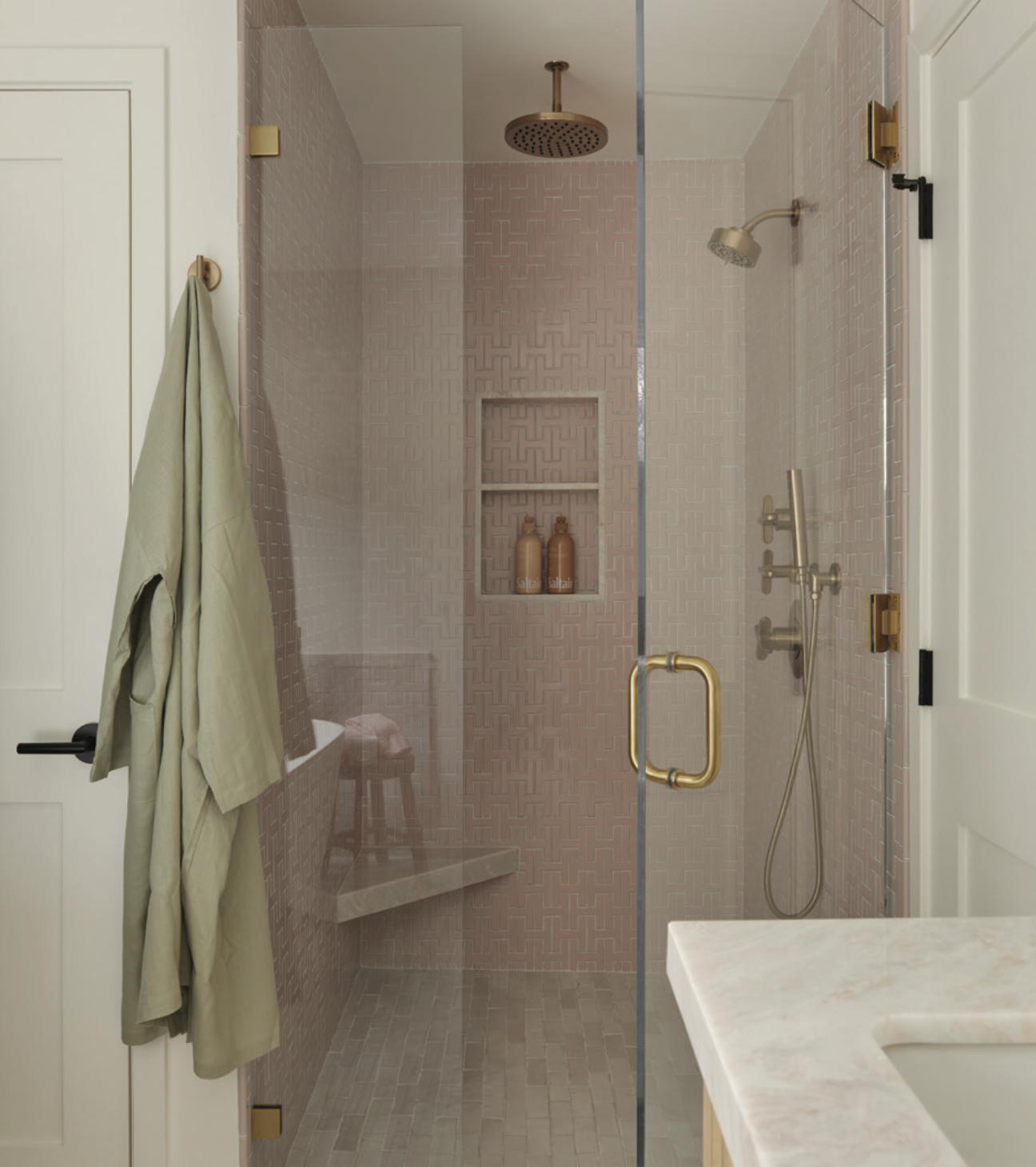
“Shower tile is one of my favorite things, and I had always wanted to do a pink bathroom,” said Greenfeld.
When he asked the client about using pink in the bath, he received a resounding “yes.” In his hunt for the right tile, Greenfi eld stumbled upon a pink-hued, H-shaped one from Fireclay.
“You really don’t see tile in this shape,” he said, adding that it reminded him of the Hermès “H.” As each tile must be painstakingly applied individually, the shower walls – including an inset shelf – are truly a labor of love. Gold fixtures and fittings installed here read a bit like rose gold thanks to the tile reflection.
Originally, the homeowner had requested farmhouse style for her personal bath, but Greenfeld refused because he feels farmhouse is dead and buried. He convinced her instead to go with a more natural, organic and contemporary take on farmhouse. The tiles used on the floors throughout – as well as on walls by the soaking tub – honor that take with their white brick format but are zellige in make, adding an artisanal look. Meanwhile, instead of slab fronts on the white oak vanity, the designer chose a slatted surface, which echoes beadboard walls one might see in farmhouse-style bathrooms.
A Wide, Open Space
With the new addition positioned to the side of the house off the existing kitchen and dining room, the designer took advantage by carving a sliver of the addition’s footprint to nudge the width of the dining room and kitchen just a bit. Then he removed the wall between kitchen and dining, creating one visually bigger and brighter space.
The revised parameters enabled the design team to install a new side wall of floor-to-ceiling cabinetry, with space enough to perfectly fit the new refrigerator. These cabinets function as a new pantry to which the homeowner now has direct access while cooking, as well as a place to stash some cookware that might otherwise create clutter. For instance, there’s an appliance garage for items that would typically take up counter space – such as a coffeemaker, blender and toaster – with a lift-and-retract door, a base that slides out and an interior light. This simple touch is the client’s favorite part of the kitchen, according to Greenfeld.
Along the sink wall, new base cabinetry topped by a quartz countertop extends to a recessed section that was previously a breakfast nook. Here, new passthrough windows create a direct connection between a beverage fridge in the extended counter and the backyard deck. All the perimeter cabinetry was finished in a light-green tone the designer is admittedly now obsessed with. This came about because the homeowner likes neutrals but also a slight pop of color. The same zellige tile from the primary bath, but in a creamier tone that complements the chosen green, makes up the backsplash.
Center of Attention
The removal of the galley wall that separated the kitchen from the dining room not only opened sightlines but freed up space to implement a 5-by-8-foot island. Constructed from rift white oak, the island contains a six-burner range and storage and supports a quartz countertop, bringing the usable surface area total from 24 to 75 square feet.
As for a range hood above the burners, the designer was strongly against one that hangs down because it would impede the line of sight. And a downdraft unit would’ve taken up too much cabinet space. In the end, he specified the Zephyr Lux Island range hood, which doesn’t at all protrude. The result is a clean-lined design where the hood almost disappears into the ceiling.
With this remodeled kitchen, the client finally has more than enough storage and functionality for everyday routines, as well as a visually open and spacious backdrop for entertaining at home.